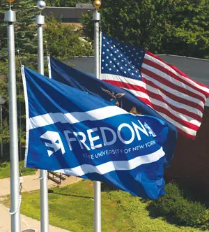
In June, the university announced a new name and visual identity. Going forward, it will be known as, “The State University of New York at Fredonia,” although in most contexts, it will be referred to simply as, “Fredonia.”
The change comes in response to growing feedback, coupled with a yearlong research effort led by faculty, staff, student and alumni representatives from across the university, which revealed a degree of inconsistency, and even some confusion, among certain target audiences. Specifically, the use of “SUNY Fredonia” in some contexts and “Fredonia State” within others has caused some to think that two separate institutions existed. The confusion has been greater for out-of-state and international audiences, although it existed in some cases even within Western New York.
In addition, the research showed that out-of-state respondents don’t recognize or understand the SUNY acronym, often mispronouncing it or not recognizing it as an institution of higher education without the word “college” or “university” included. This is especially true with international audiences.
“An emphasis in Fredonia’s strategic plan is expanding our role as a global community, welcoming out-of-state and international students and encouraging all Fredonia students to learn about the world and their places in it,” said President Virginia S. Horvath. “A first step for us to be known is to have a single name that reflects our unique identity and our role as part of the State University of New York.”
In addition, the university has added a new logo mark, to provide a visual that will help more people recognize and remember Fredonia. The campus’ research helped guide this process as well, including feedback gathered during a variety of focus groups, surveys, and open campus presentations throughout the past two semesters.
“Our findings showed that students, families and other visitors to campus are often impressed by Fredonia’s beauty and the distinctiveness of its architecture — especially its iconic I.M. Pei buildings. I know I felt that way when I first visited,” said Erin Doroszynski, the 2013 Student Association president and student representative on the branding team. “They’re relatively unique within the SUNY system, and they provide a natural point of distinction for Fredonia.”
President Horvath added that the internal design and implementation team, led by Communications Designer Patty Herkey and Marketing and Communications Director Mike Barone, did an excellent job of incorporating the architecture into the logo, while creatively incorporating a pair of three-dimensional ‘F’s – one white, and one reversed, in blue — coming together to form a multi-story structure.
The converging Fs also naturally form arrow-like visuals. These serve as metaphors for the progress and transformation which Fredonia students experience, as well as the leadership role the university takes in the community from an engagement and economic development perspective. At the top and right of the logo, the converging Fs also form a mortar board and tassel — the traditional cap worn during a graduation ceremony.
The branding team was quick to add, however, that the research also showed Fredonia’s students and alumni were proud to be part of the State University of New York, with many respondents saying they felt “smarter” for having chosen an affordable university. Fredonia’s faculty and staff share a similar sense of pride in having chosen a career in public higher education, knowing the life-changing impact it has for many students.
“They recognize the quality and value which a Fredonia degree represents, which is why the State University of New York is still well represented within our new logo,” explained Alumni Affairs Director Patricia Feraldi. “Many of our nearly 45,000 living graduates will always embrace the university as they remember it, whether it was SUNY Fredonia, Fredonia State College, or even Fredonia Teachers College. Like the ever-changing campus itself, this is just another step in our evolution, and we’re confident that our alumni will embrace Fredonia’s future while still holding their personal memories dear to their hearts.”
The timing of the new identity is especially appropriate, as the campus opens its new, 92,000-square-foot Science Center. This building, which meets LEED silver standards, is designed for the hands-on, interdisciplinary ways through which students best learn science today. It is re-shaping the way people think about Fredonia, its commitments to sustainability and student learning, and its academic strengths.
“Campus leaders have worked hard for years to ensure that Fredonia prepares for and invests in the future of its students,” President Horvath concluded. “In many ways, Fredonia has been re-branding for several years, with new academic programs, greater public engagement, and attention to facilities and approaches that help today’s students learn best. The heart of what we do will remain the same: challenging and supporting students as they discover their passions and prepare for the world beyond graduation. This new visual identity boldly reflects this continued commitment to inspiring the next generations of Fredonians.”